Why Grey-Blue Is the Wedding Guest Colour Nobody Talks About
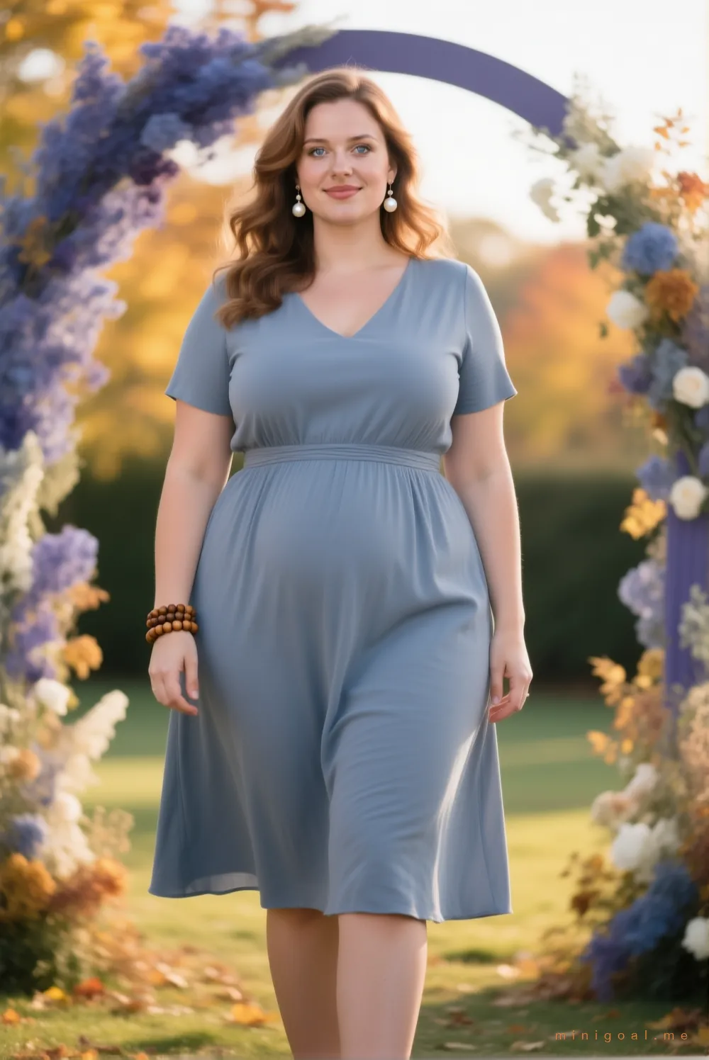
Emma kept showing up in other people's wedding albums looking washed out. Then she wore grey-blue — and the same photos looked like a different person.
Why warm neutrals go muddy indoors
Reception lighting is warm and dim. Warm-toned dresses soak that up and lose contrast against wooden floors, cream linens and candlelight. Cool, muted tones do the opposite: they hold their shape instead of blending into the room. That's the whole trick — and it had nothing to do with Emma's body.
Rule 1 — Cool and muted beats bright and warm indoors
Grey-blue, dusty blue, soft slate. Each has just enough grey in it to soften against warm skin and enough saturation to stay visible. It's the difference between a colour that looks chosen and one that looks faded.
Rule 2 — Formality lives in the fabric and the cut, not the sleeve
Short sleeves are perfectly fine at almost any reception. What makes a dress read “dressed up” is structure: a fabric with body, a neckline that was decided on purpose, a hem that lands where it should. Emma's grey-blue midi is short-sleeved, fully lined, and reads more formal than most long-sleeved jersey dresses.
Rule 3 — One blue that flatters every skin tone
If you only own one wedding-guest colour, make it grey-blue. It's the most forgiving blue in the spectrum — cool enough to sharpen a warm complexion, muted enough to never shout over the couple's palette.
Shortcut: when a venue is indoors and the invitation says “evening”, reach for a cool muted tone before a warm one. Your photos will thank you.
Loved this? The Outfit Tab in our app recommends looks based on your body type, the occasion, and the weather — no fitting-room tears required. → Try the Outfit Tab